

Michaels Design System
A design system is a set of standards to manage design at scale by reducing redundancy while creating a shared library and visual consistency across different pages and platforms.
-
Our mission is to establish a unified and scalable design system that brings consistency, efficiency, and accessibility to all Michaels digital experiences. By creating a cohesive visual language and reusable components, we aim to empower teams, streamline collaboration, and deliver intuitive, user-centered experiences across every platform where our customers engage.
-
I led the creation and implementation of Michaels’s design system, addressing a critical gap in consistency and user experience across digital platforms. I collaborated cross-functionally with engineering and brand teams to develop a comprehensive library of reusable components, design tokens, and documentation. Through strategic rollout and ongoing governance, I ensured seamless adoption, resulting in improved design efficiency, a cohesive visual language, and a significantly enhanced user experience across web and mobile platforms.
UX/UI Methodologies & Techniques:
Specific component UX research
UI design
QA of implementation
Style Guide
Pattern library
UI Inventory
UX Audit
Software:


Collaborated with a design lead and developers at a leading retail company to build a consistent, scalable design system—transforming designs into reusable components using Figma as the primary tool.
The challenge
In each new project phase, we were rebuilding components from scratch, leading to inconsistent styles and repeated design work. To solve this, I helped audit and recreate existing components, collected past use cases, and established standardized, reusable components to ensure consistency and efficiency across projects.


The benefits
Centralized source for viewing all components, patterns, and styles.
Enables scalable redesigns and updates across projects.
Frees up designers to focus on solving complex problems rather than visual tweaks.
Speeds up the design process with reusable, pre-made components.
Promotes consistency by reducing the need to reinvent common elements.
Minimizes wasted time and miscommunication between design and development teams.

The Approach
We started by integrating an existing style guide as the foundation for the design system, which gave us a strong starting point. Our focus was on linking this guide to the system and implementing any new elements or updates needed to keep it current. This approach ensured consistency while allowing the design system to evolve and scale efficiently.
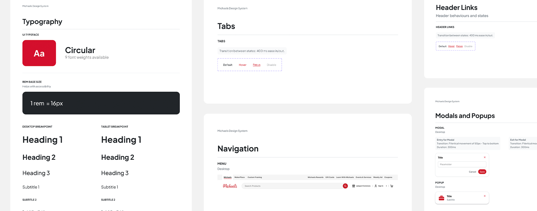
The style guide consisted of:
In-page annotations (how we document and layout each component within the library)
Branding (colors, typography, web, logos, etc.)
Spacing guidelines
Layout grids
Icon pack
*These style guides are incorporated into the component library as well, to provide relevant guidance in context.
The whole team got together to create a components list based on the common components used within the projects and any new components that are needed in future. Creating this library did take significant time and resources.
The component library consists of:
Component name:
A clear and unique UI component name was essential to ensure accurate communication between designers and developers and prevent implementation errors.
State changes:
Recommended defaults and the subsequent changes in appearance.
note taking:
Page annotations and descriptions to understand what component you were looking at.
breakpoints:
Any size indication and breakpoints for the developers.

Documentation
Documentation is always included on the same page as the component this was to explain any use cases that were created. This consisted of:
A clear explanation for what this element is and how it is typically used, occasionally accompanied by dos and don’ts for context and clarification.
Picture examples so that it was clear what we were talking about
Rules of when to use the component and how to use the component
Each component would have variants and each variant would be correctly named so that when it came to publishing the components it made it easy to understand the state changes and what you can turn off and on to get the desired component.