

02/ Michaels
The Michaels Companies, Inc. is the largest arts and crafts specialty retailer in North America providing materials, project ideas and education for creative activities.
↓

Homepage

The Michaels homepage has evolved from traditional carousel banners to a story-driven promotional format, aligning with UI/UX best practices like reducing cognitive load, enhancing visual hierarchy, and improving user engagement. This consistent, user-centered approach has proven effective across platforms, reflecting forward-thinking and responsive design.
standard
The homepage is updated on a weekly basis. Each creative component is designed to scream Michaels throughout the page.

RED, WHITE AND BLuE
This is a Red, White and Blue story homepage take over based on the flag’s color and significance from top to bottom.
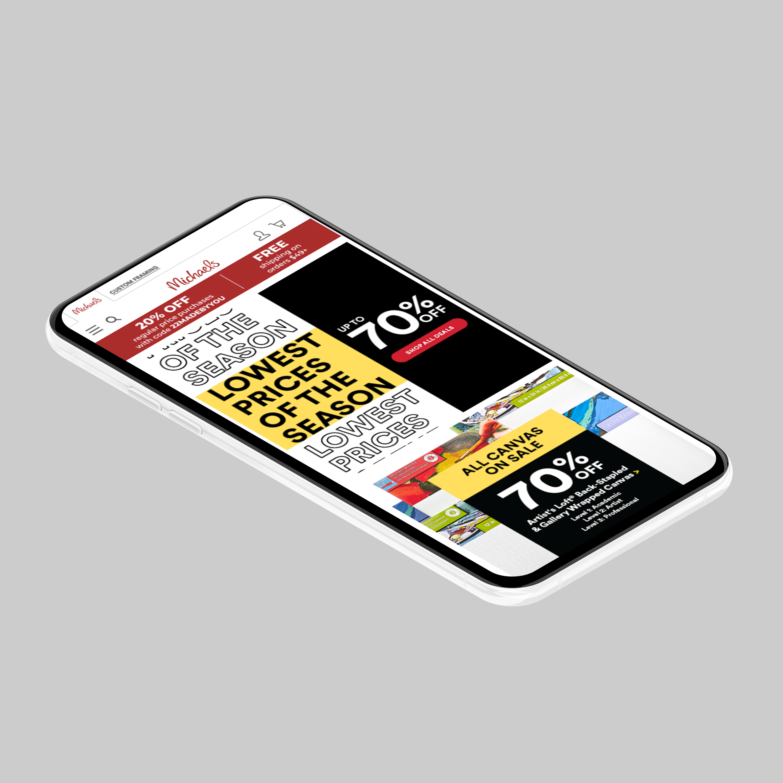
Lowest prices of the season
Based on the business forecasts and strategy, this is one of the strongest campaigns of the year.
landing pages
Collaborating with the development team by providing each component (banners, icons and images) we were able to create experiences for the Michaels customers, either to get deals, promote events and showcase the existing, or upcoming products and décor collections.

Affiliate Program
This page reflects all the benefits associated with the Michaels affiliate program. The creative direction was to make it relatable and fun to persuade people to join the program.

Cowboys
From DIY crafts to game day decorations, this landing page design captures the bold spirit of the Cowboys with dynamic layouts, team colors, and engaging visuals.

PUROLATOR
The Purolator landing page purpose was to facilitate the information about it’s services and how customers could take advantage of the partnership by shopping and shipping.
This email section highlights a variety of campaigns, including “This Just In” announcements, seasonal features, and custom framing promotions, each designed to capture attention and drive engagement. Clean layouts, vibrant visuals, and strong brand alignment create a cohesive and compelling subscriber experience.

This just in
This “This Just In” email features bold visuals and clear messaging to highlight new arrivals in a fresh, eye-catching layout.

Trend
This Michaels Lux for Less email showcases stylish, budget-friendly finds with an elegant layout and upscale, trend-forward visuals.
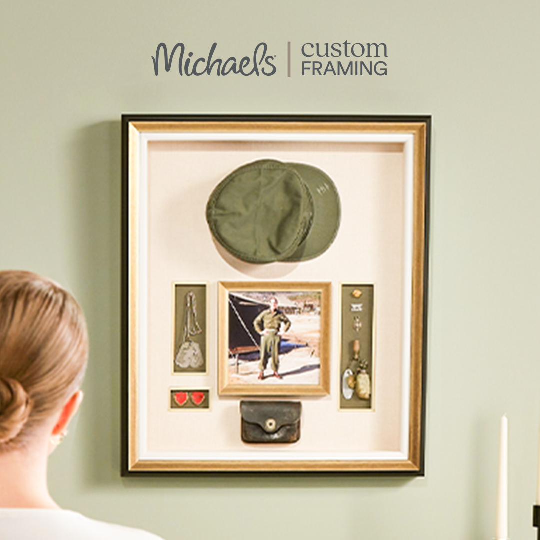
Custom frame
This Michaels Custom Frame email showcases personalized framing with bold visuals and a clean, functional design.
Marketing Collateral
These assets have different placements across digital platforms, which requires different composition, focus points, and dimensions that go from email slices, web banners social and paid media.


Michaels design system
A design system is a set of standards to manage design at scale by reducing redundancy while creating a shared library and visual consistency across different pages and platforms.
dIGITAL EXPERIENCES: WEB / email / social & Paid media / app
I’ve had the opportunity to collaborate, learn and grow. Being surrounded by an incredible team has challenged me to create a cohesive experience for our customers through all marketing digital collateral assets such as email, homepage, category pages, e-commerce, and the retail app.